
Logo Design
A handful of logos created for various clients.

Created for a fitness client. The ideology behind Project Fit-R is self improvement. This is represented by two bodies sculpting themselves into what they envisioned within. The never ending self improvement process is also represented by a very subtle infinity shaped base.
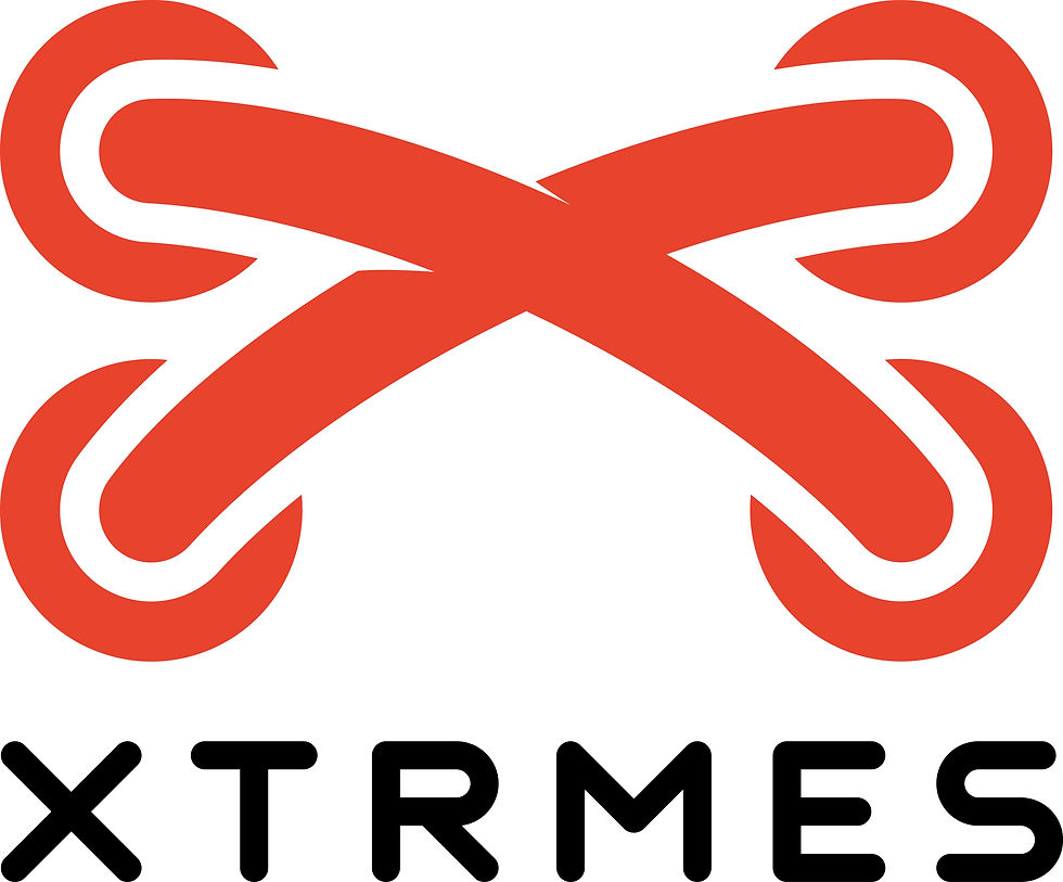
Created for a shoe company that specializes in custom shoes for abnormal shaped feet. The client needed a brand image to represent the wide set foot options they offer. Not only does this play off the 'X' in Xtrmes, but it also is a visual representation of shoelaces crossing.

Created for a client that sells hazelnuts. I utilized light, vibrant blues and greens to convey an image of health. The line art style was used to also convey a sense of playfullness.

Created for an individual's persona and future blog post. She is very active with fitness and cycling, but also very playful. She can be the nicest person, but could also knock you out. She already had the name. I created this logo to match her tone.

A logo for my Agency in my Spring 2016 Campaigns class. A star takes the place of the 'A' in the different color lane. Those two elements were created to symbolize the path to success is with Starter.

An alternate logo for an agency name in my Spring 2016 Campaigns class.

Tasked with redesigning a logo for a brand of my choosing, I chose the car brand Lotus. Minimal to no words were to be used. The initials of the founders were the the only letters I used due to the heritage behind the brand.